"Excel Range Media", the leading provider of digital marketing services in Delhi, India, has assisted more than a thousand clients in achieving consistent development for their companies.
Connect With Us
Welcome to the leading Digital Marketing Agency and Institute in Delhi. We are committed to delivering exceptional digital marketing solutions to businesses while also offering comprehensive training programs. Our team of experts is dedicated to providing the best services and education in the industry. As the best Digital Marketing Agency in Delhi, we understand the unique needs of businesses in the digital landscape. With our proven strategies and innovative techniques, we help our clients achieve remarkable online success. From search engine optimization (SEO) to pay-per-click (PPC) advertising, social media marketing and email campaigns, we have the expertise to propel your business to new heights.
What sets us apart is not only our agency services but also our esteemed Institute. As the best Digital Marketing Institute in Delhi, we take pride in shaping the future generation of digital marketers. Under the guidance of our renowned mentors, our students gain practical knowledge and skills in digital marketing, web design and more. Our real-world projects and hands-on training ensure they are well-prepared for the industry, with many securing lucrative positions or launching their own successful ventures. Our focus is on delivering exceptional value to our clients and students, ensuring their success in the competitive digital landscape. Trust us as your partner in digital marketing, and together, we will achieve greatness.
Contact us today to experience the expertise of the best Digital Marketing Agency and Institute in Delhi. Let us help you unlock the true potential of your business.
For The Best Results In The field of Digital Marketing
Get In TouchYear In Business
Team Members
Happy Clients
Budget Managed
Websites Delivered

Creatives Delivered
With a rich portfolio of over 100 visually appealing websites, 2000+ successful social media campaigns, and thousands of advertising campaigns, we stand as the forefront full service digital marketing and creative agency.
Benefit from our holistic approach that combines practical industry experience & advanced knowledge, empowering you to achieve marketing success.
Our Professional Experts have extensive experience working with prestigious businesses across diverse industries, ensuring that you receive top guidance & insights.
Personalized digital strategies that align with your objectives, target audience, and competitive positioning, driving success for your business.
Timely project delivery is our commitment. We prioritize reliability, streamlined processes, effective communication and client satisfaction for on time execution.

When it comes to achieving outstanding marketing success, partnering with the right digital marketing company is crucial. At Excel Range Media, we take pride in being a trusted and results-driven digital marketing company, serving as an esteemed SEO company, website designing company, social media marketing agency and the best digital marketing institute in Delhi. Our expertise and commitment to excellence empower businesses in Delhi to thrive in the competitive digital landscape.
As a leading & best digital marketing company in Delhi, we understand the unique challenges and opportunities presented by this dynamic market. Our team of experienced professionals is well versed in the latest trends and techniques that drive effective digital marketing strategies. Whether you require search engine optimization (SEO) services to improve your website's visibility, creative and responsive website designing to enhance user experience, social media marketing campaigns to engage and grow your audience, or comprehensive digital marketing training at our institute to acquire industry relevant skills, we have you covered.
“It’s Crazy How Fast Time Flies and How Things Progress” – Nathan Chen
Take Action and Start your project with us!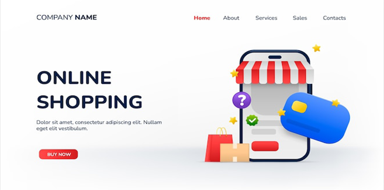
WordPress, Shopify, Magento
HTML, Css, Js, Jquery, PHP
Graphic, Print
Facebook, Instagram, Youtube, Linkedin, Twitter etc.

India Inc.

Best eCommerce Development Company
BW India

Top Web Developer 2021-22
Unwavering Commitment: We Promise, We Deliver Excellence!
Let's Work TogetherWhether its small startups or large corporations with significant promotional and marketing requirements, we can digitally promote and market for all industries.
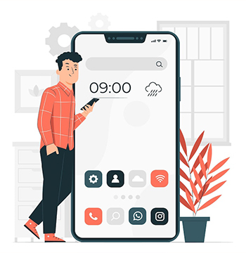
Social Networking
Digital Marketing
Ecommerce Development
Video Service
Industry
Enterprise Service
Education Service
Tour and Travels
Health Service
Event & Ticket
Restaurant Service
Business Consultant
It has been an amazing experience with Excel Range Media, Got Good Returns.

They have got a really nice team, works in sync and with full of passion. Highly Recommended.
Hard work, Honoring the Commitment & Humble in providing Services, Thumbs up for Excel Range Media.
Read our reviews from all over world.